Responsive Web Design – Mobile Web
- 23/06/2014
- Responsive, SEO Posts, Website
Mobile Web Design
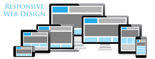
The design of mobile web, often called responsive web design is a web design strategy aimed at optimizing the visual experience of any device that can browse the Internet. This new technology represents the future of Web Design as the number of devices with which you can access the Web is constantly growing.
Why is responsive design so important?
The top 5 Reasons to use responsive design:
1. Responsive design is becoming increasingly important. Most people have a cell phone with them every day and use it a lot. Thanks to a research carried out by Google, there has been an increase of 400% in Google searches from mobile devices compared to last year.
↑ 400%Google Mobile
2.The same research shows that one fifth of all Google searches are made from a mobile device. So it is crucial for a company to have your own website which is also available for mobile devices. It is believed that searches from mobile devices will surpass desktops in a few years. Customers research on their mobile device above all for things like opening hours, locations, phone numbers and services. As a result, mobile sites should contain this information.
1/5 of Google searches are Mobile
3. Given that the screen of a mobile device is small relative to the screen of a desktop it is very important to adapt the website to the smaller screen. Mobile sites should be created intelligently and should contain the most important information on the main screen. The user should be able to see all the necessary information without having to click several times on the small screen.
Small screen = less info
4. A huge number of customers check on the Internet on their smartphones before buying a product. Many people compare different products and evaluate which they like most. In many cases, customers buy the product directly from their smartphone. The customer can buy it without having to go to the store, can pay online and get the product sent to their own home. This method of purchasing products or services is increasing significantly given the greater ease for customers to compare all the offers and buy them online, and the ability to use their smartphone to navigate more and more on the internet.
- Checks on smartphone
- Compares prices!
- Purchases!
When you create a mobile website you should always take into account technology and the speed of the internet of the targeted audience, but especially the display size. Although resolution on small devices is getting better, it is still impossible to optimally visualize a desktop format website. Therefore, creating a format compatible to the screen size will be the primary goal in the phase of creating a mobile site. The next thing to think about is technology. In many third world countries internet browsing is done via telephones, which for most may not even be smartphones.
Responsive = fast
What can you do with the responsive websites?
It is important to adapt the website to a format for mobile devices. For users, the compatibility for mobile devices is very useful; it facilitates use and therefore the user will visit the site more often. The best design to use is a reactive one: it automatically resizes and adapts according to the different types of mobile devices.
With the design of mobile web sites you can make it easier for customers to click a certain button. The navigation is very simple, thanks to a clear overview and specified information.
Companies can benefit enormously if their websites are mobile-friendly: they can make sure that everything is easily findable, such as contact details and product information; the load time will decrease when a company uses a special site for mobile devices; you can increase the number of visitors, if done correctly. If a company does not use the design of mobile websites, 40% of users go onto the sites of the competition.
How do you correctly use Responsive Web?
How do you optimize websites with all devices and operating systems?
When constructing a mobile web site is extremely important to make sure that it functions on all operating systems. If this is not done, it is likely that potential customers leave your site because they cannot access it.
How do you make a mobile site work on all operating systems?
There are several programs to test a mobile site to check if it works. It is very important to use these programs before publishing a mobile site to make sure it works properly.
Graphical difference between a standard and mobile website?
Companies must ensure that their mobile sites resemble their normal websites because doing so will make it easier for the customer to find the information that he or she has previously found on the normal website. The mobile site should look similar to the normal one also for reliability: if the mobile site differs too much from the normal site it may cause the situation of people, who would like to buy something, not ending up buying anything because they are not sure they are on the right site.
How to maintain low load times?
People get annoyed when the load times are very long, so it is very important for your site to load quickly. An example of how important it is would be Amazon. Amazon, in 2006, reported that for every load of less than 100ms, their earnings have increased by 1%. 85% expect the mobile site to load faster than or as fast as the normal site and 33% would go to the competition. Given that nowadays many purchases are made on the internet this is an important aspect. But how to do it?
First of all, try to limit the images. Also put the most important information on the homepage, and thereby avoid additional clicks to get information, which maintains low load times. Also using fast hosting is a way to keep down the loading time.
Come rendere l’interfaccia user-friendly?
It is very important to make a mobile site user-friendly. When a mobile site is not user-friendly, there is a chance for prospective clients or for existing ones to abandon your site. Here are some tips to make your website user-friendly mobile:
- Easy navigation
- Link to the full version of the site
- Recognisability to the normal website
- Touch screen. Design
- Limitation of images
What shouldn’t you do?
Do not try to create a site unless you are a professional in this field. Your site should look truly professional in order to attract customers. If you cannot create a web page, find someone who can do it for you. If you try to make a site, ending up with an unprofessional look, potential customers will change their mind and go to a competitor’s site.
The content of the website should be written in the “language” of the reference group. Please try to match the way you use words and grammar. In this way, the customer will feel at ease on your page and not feel the sensation of being out of place. By adapting to potential clients, the client will feel that the site is personally addressed to him or her. This will create a feeling and a positive view of your company.
SeoWebMaster propone periodicamente articoli d'attualità nel mondo di SEO, siti web e, più generalmente, di tecnologia. SeoWebMaster periodically offers current posts in the world of SEO, websites and, more generally, of technology. SeoWebmaster bietet regelmäßig aktuelle Beiträge in der Welt der SEO, Websites und, ganz allgemein, der Technologie.
SeoWebMaster and blog
The agency offers a complete service in web area, by updating you also about the most recent technologies through this blog. We provide our experience in each phase of development process in order to reach optimal results in different areas
Request a quote
We offer professional SEO services which will help your website increment the organic search traffic and compete for the 1st page with the most strategic keywords.


